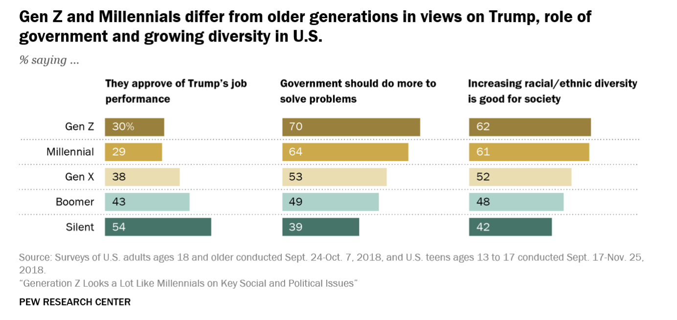
Bar Charts
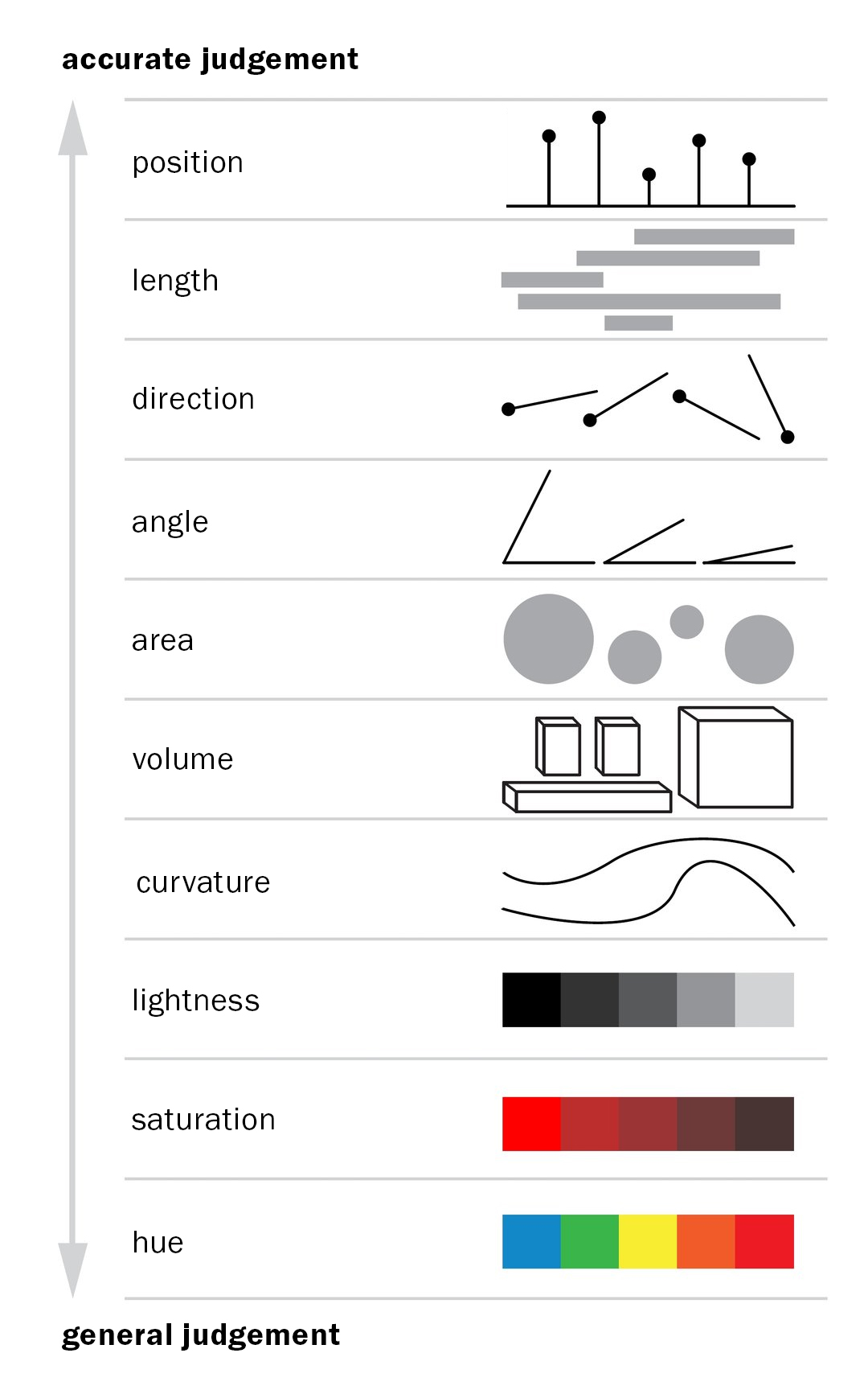
Very accurate
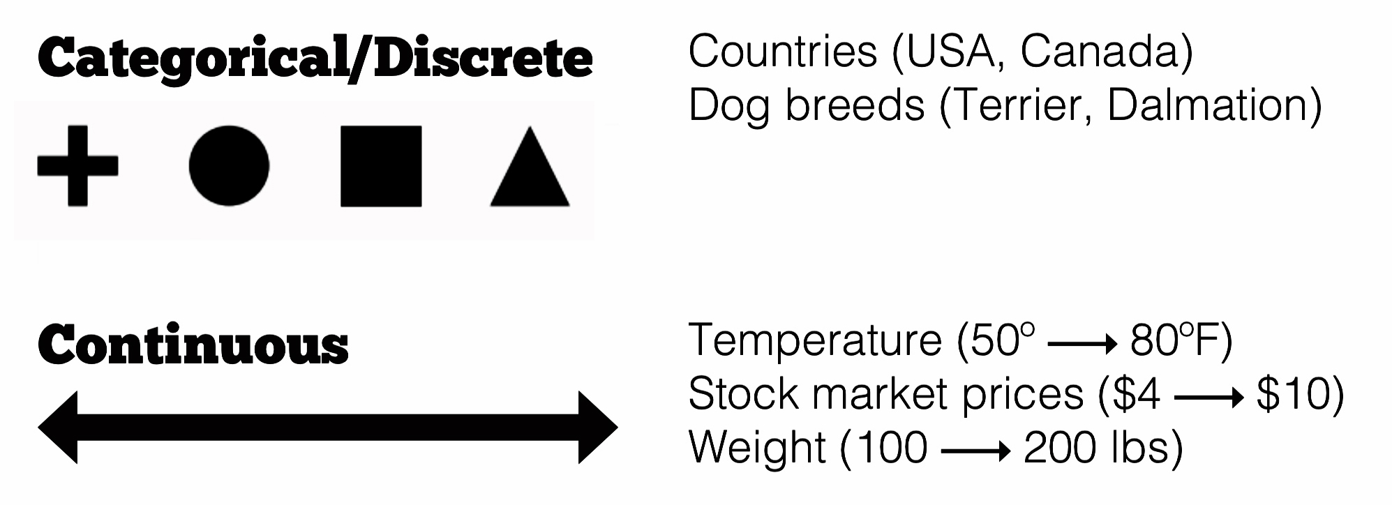
Distinct/categorical data
Good for making comparisons
An intro to charts and data visualization
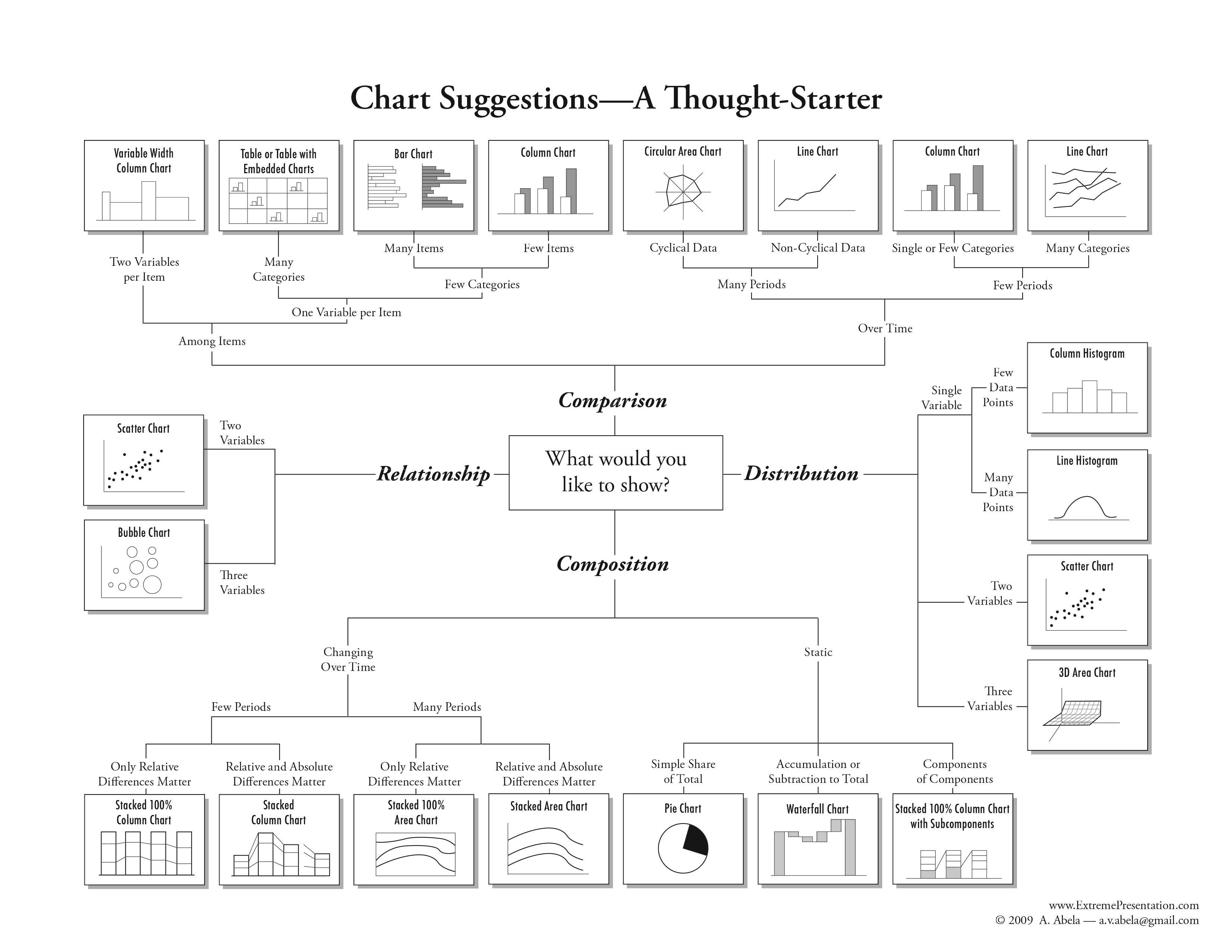
How do I best show my data?
How to spot different chart types in the wild
How to make them!
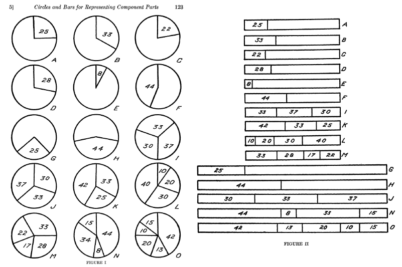
Same data, different encoding
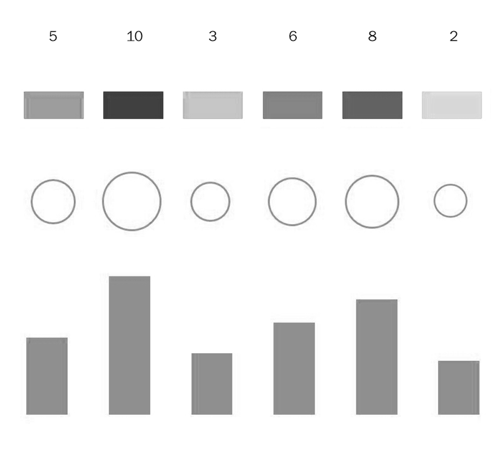
How important is accuracy?
Gabriela Plucinska, based on a 1984 Cleveland & McGill study
What are you trying to show?
Encoding matters!
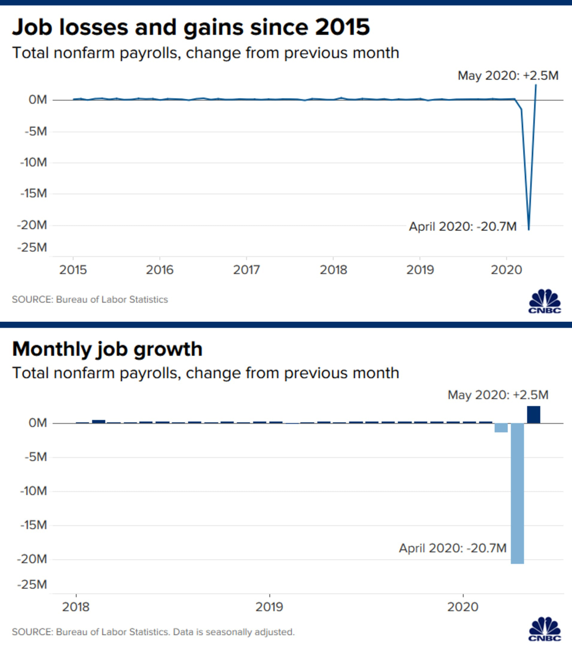
Bar vs Line
Very accurate
Distinct/categorical data
Good for making comparisons
The bread and butter of data viz
But bar charts can be powerful too!
Or appear in unexpected forms
Continuous data
Good for showing trends
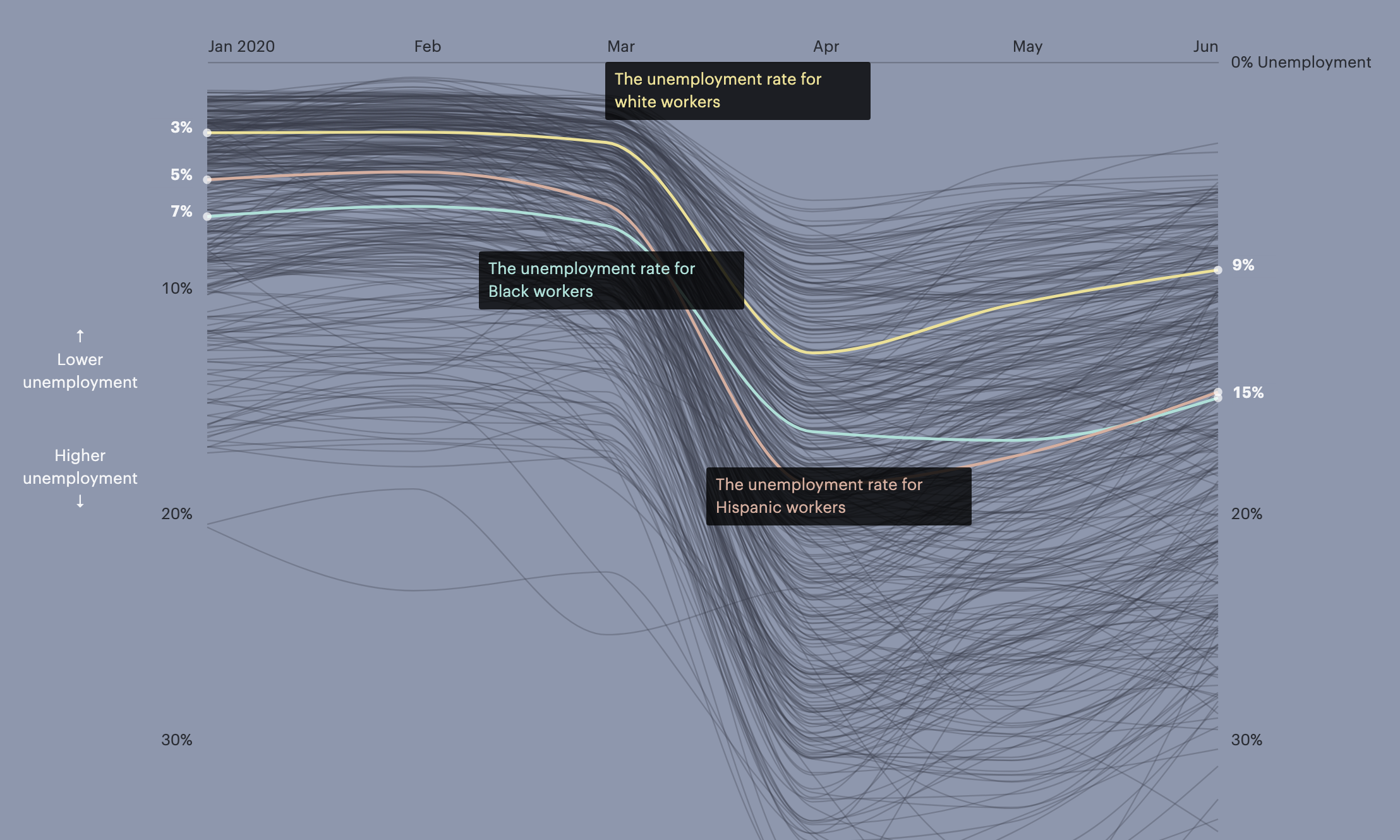
Line charts are good for showing data over time
Whether that's telling one story...
...or making comparisons
...or showing proportions
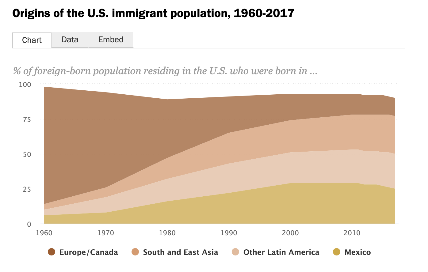
Good for showing parts of a whole
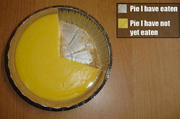
Use sparingly
The best pie chart
The worst pie chart
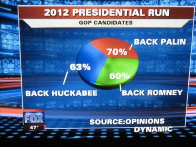
Ok, maybe this is the worst one
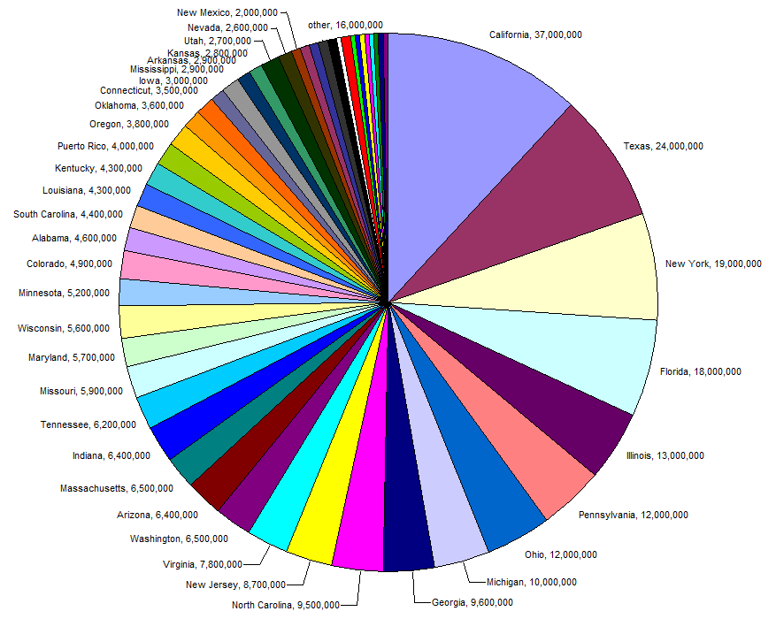
The more slices, the harder to read
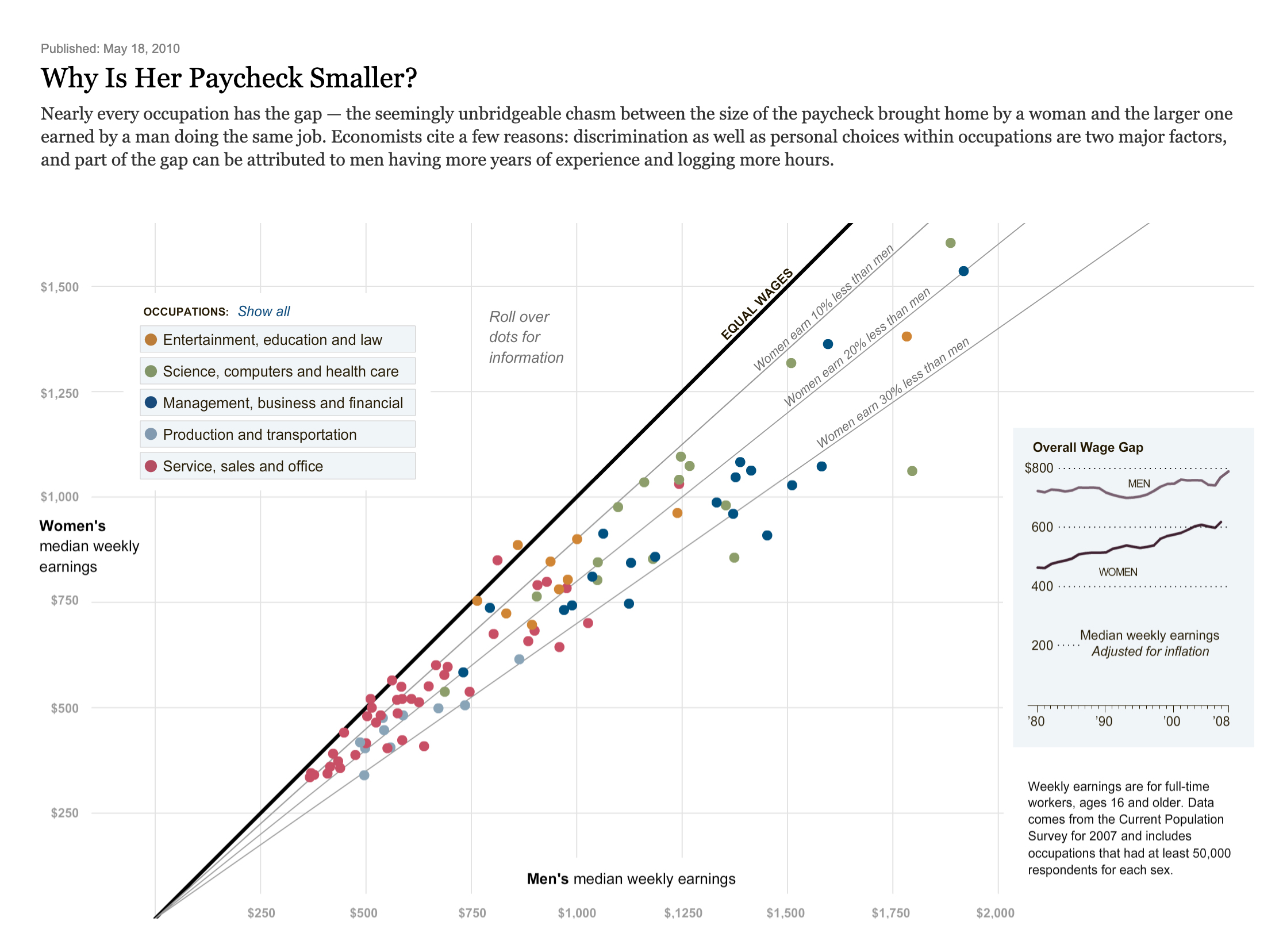
Good for showing relationships
Trickier to read
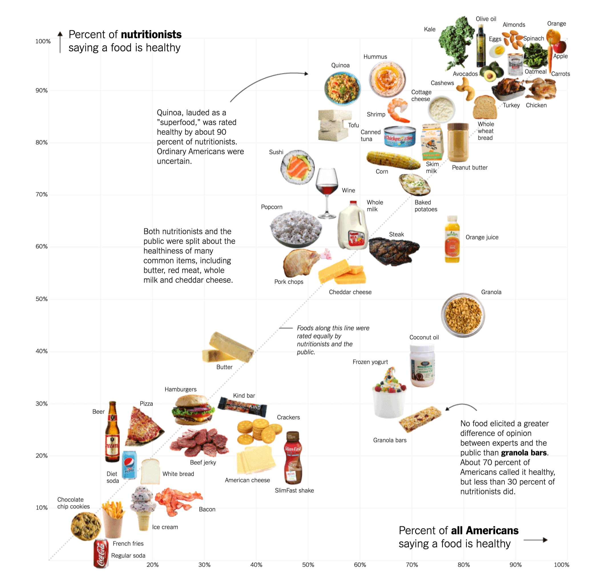
Scatterplots can show a lot of data at once

They can show inequality
They don't have to be boring!
Good for when geography is important
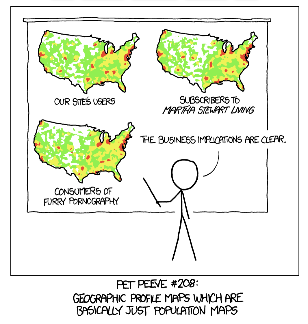
Beware the population map!
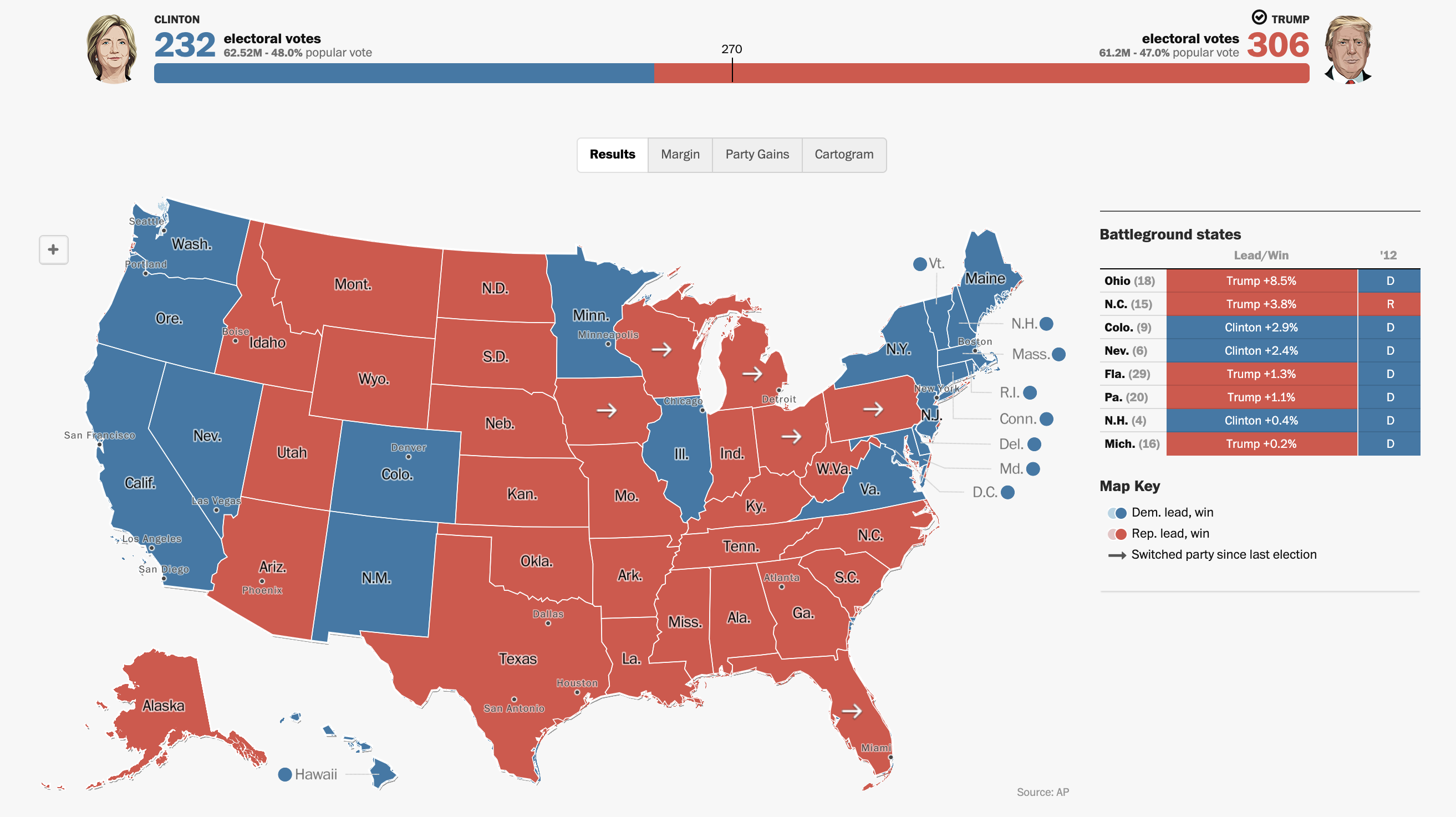
Choropleth map: typical election map
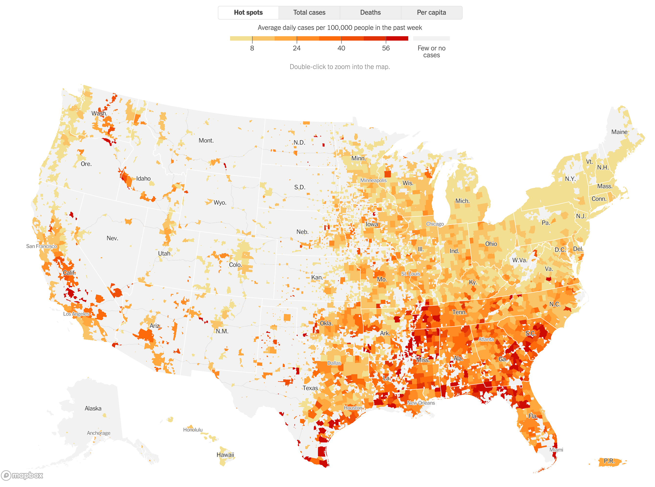
Choropleth map with smaller geographies
Cartogram: when geography is less important
Cartogram: quickly make comparisons
Symbol map: to show specific places
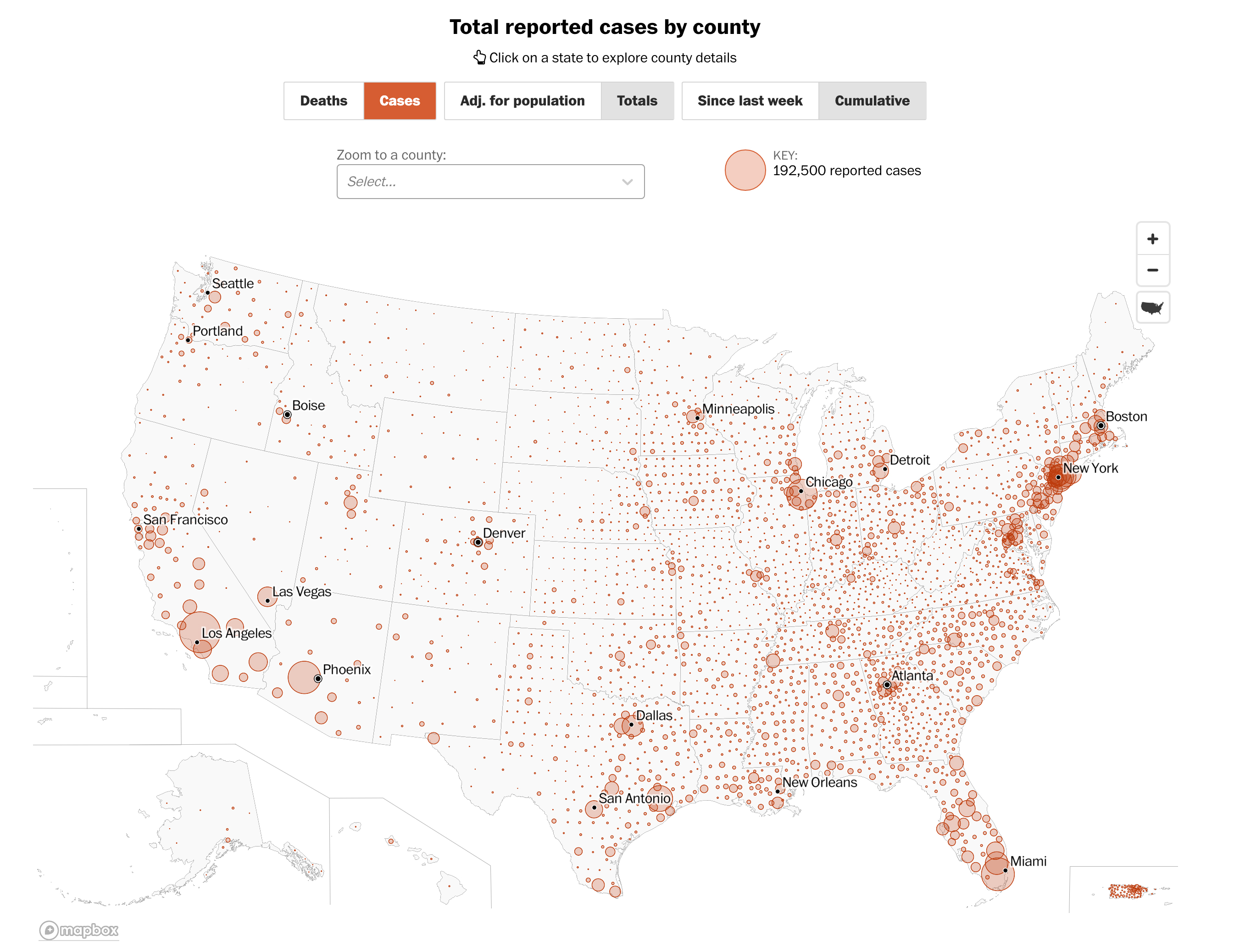
Did you just make a population map?
Totals vs. per capita

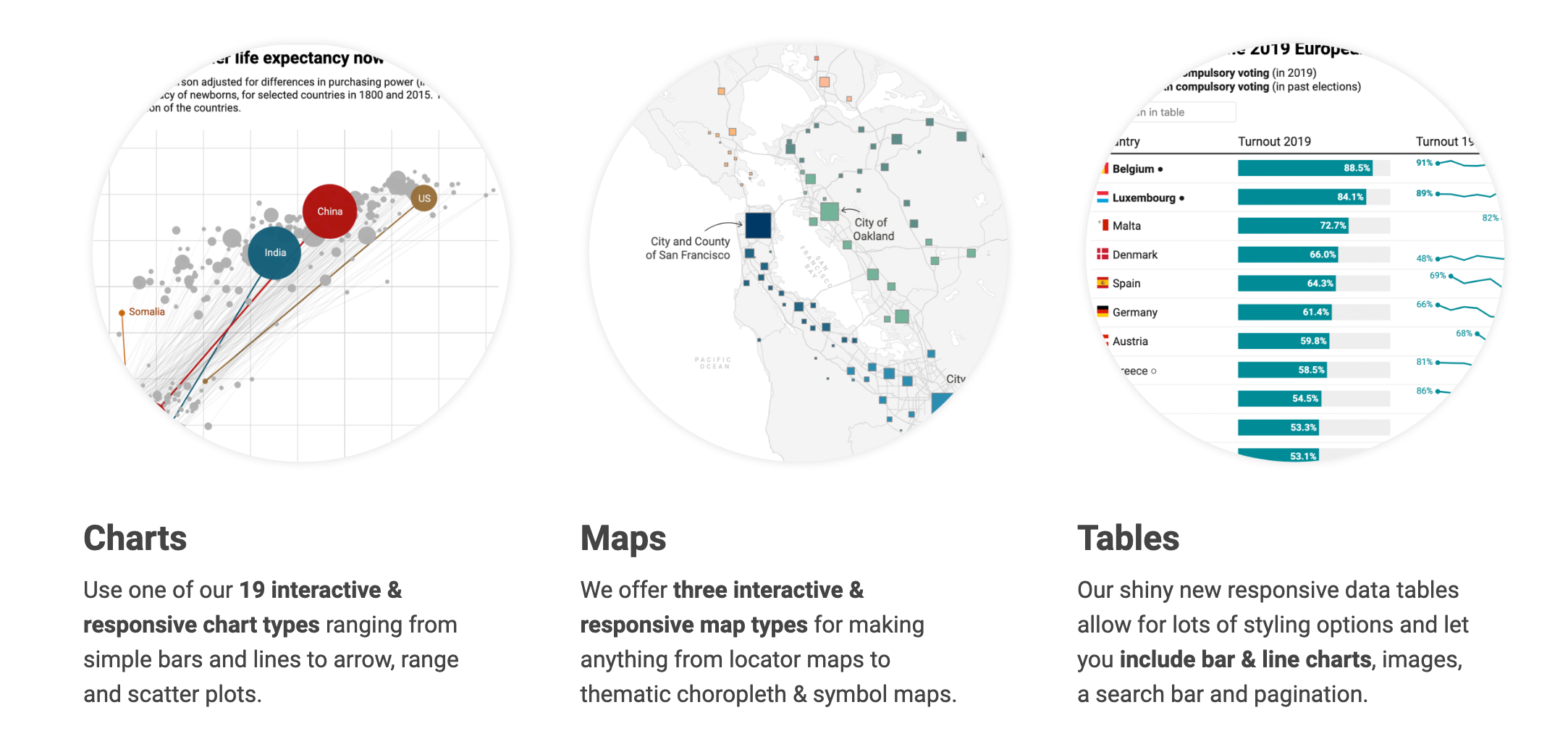
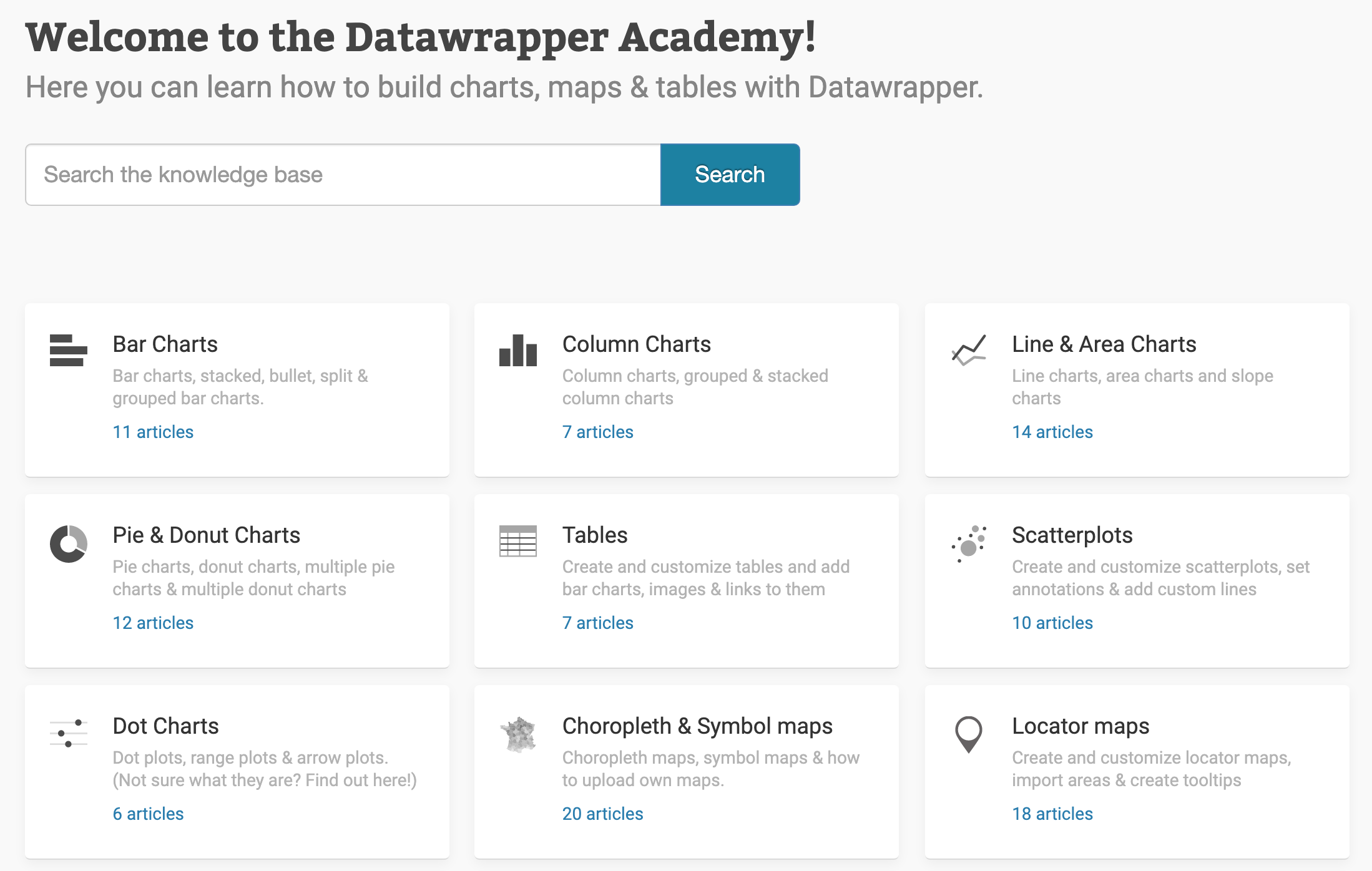
Free online tool for making charts and maps
They have tons of tutorials for all kinds of chart types
I made a few also: