The Structure of Scientific Activity
May 25, 2010
Tags:
Communication
Design
Science
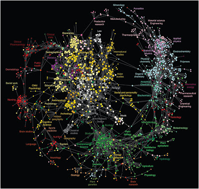
What does interdisciplinary look like? Starting from science outwards, it may look something like this crazy multicolored dotted web-wheel. Scientists collected data on over a billion user interactions with online scholarly portals, tracking the activity of scientists and the general public as they clicked through and engaged with publications in all sorts of disciplines. The result? A clickstream map of science that suggests just how interconnected the dynamics of scholarship can be. The wheel's hub is formed from closely-related journals in the social sciences and humanities, while the rim is made up of natural science journals. The spokes are journals that connect across disciplines (fields like brain research, human geography, and alternative energy).
Besides being pretty to look at, what is this clickstream map good for? Here's what the scientists say:
It's even getting support from humanities professors, who are chiming in about the map here. I'm all for it — science, bring on the color coding.Maps constructed from clickstream data can serve numerous functions. Like citation maps they provide a means to visually assess the relationships between various domains and journals. However, clickstream maps of science can offer an immediate perspective on what is taking place in science and can thus aid the detection of emerging trends, inform funding agencies, and aid researchers in exploring the interdisciplinary relationships between various scientific disciplines.
Related Link: article in SEED magazine on networked knowledge and Science 2.0
